04 / Proxi Maps

Uncover a hidden gem: a mobile app to share recommendations and curate local guides for effortless exploration
My Role
UX Design Lead
Project
Oct 2022 - Dec 2022
Timeline
UW User-Centered Design Class
The Team
Project Manager: Robel Gebre
Content Design: Cloe Cha
UX Research: All Team Members
UX Design: Vatsal Chandel
Context
As a part of one of my core classes at University of Washington, ‘User-Centered Design’, students were divided into teams of 4 and tasked to work with an industry sponsor on a given problem statement and formulate an evidence-based design solution.

My group chose to work with Proxi Maps, a platform use to share recommendations, curate local guides or visualize data for personal and business needs. As Proxi Maps continues to evolve, the company places a strong emphasis on enhancing user experiences, particularly in the realms of local and personalized navigation. Our team was brought on board to further this mission by transforming their existing web solution into a mobile application.

As the UX design lead for this project, I designed the mid-fidelity wireframes, conducted multiple usability testing, implemented changes according to our findings, and designed the final high-fidelity prototype.
Research Questions
In our pursuit to enhance the user experience for Proxi Maps' mobile application, we recognized the importance of understanding our users' needs. To achieve this, we brainstormed a set of research questions that will guide our research and refine our design.
Usability Research
We recruited 6 everyday mobile users and conducted our usability testing. This step is essential in gaining insights into how real users interact with the application and identifying areas of improvement. We prompted users to navigate Proxi Maps by referencing the following scenarios:
As we observed users interact with Proxi Maps, their comments and actions provided valuable insights into the strengths and areas for improvement of the application. Here are some noteworthy quotes directly from our sessions:
"I would appreciate it there were more pictures, I choose certain maps based on the photos"
"I wish there was a way to view the map points without having to individually click on each on"
"I want to be able to see what my friends are doing, where they're going, what they're eating"
"The platform feels limiting, the featured section doesn't really provide any new recommendations and its always the same featured maps."
The most important takeaways were:
01
Users find value in the visual cues as it allows them to make more informed decisions about which places to explore.
02
Users expressed interest in having personalized map recommendations.
03
Users expressed a strong desire for social integration within the navigation experience.
Through our research and usability testing, we've gathered valuable insights into the needs of Proxi Maps' users. These insights led us to formulate the following How Might We (HMW) question:

How might we create personalized and impactful features that enhance user engagement on Proxi Maps' mobile application?

Design Goals
To capture the essence of our research findings, we created 3 design goals that articulate qualities that are required for our solution to satisfy the needs of our user groups. These design goals will guide decision making and development efforts.
Ideation
After conducting extensive research and gaining a comprehensive understanding of our potential users' needs, we embarked on the ideation phase. This process involved a combination of design sketches and affinity mapping using sticky notes. We then systematically grouped similar ideas into clusters that represented a common theme among the ideas. This provided us with a solid foundation for the conceptualization of our design direction.
In our collaborative sketching session, each team member produced multiple sketches that encapsulates the functionalities identified within the categories established through our affinity mapping process.
Ideation board
We critique each others’ sketches and collectively identified the top three designs. This selection allowed us to delve deeper, evaluating the strengths and weaknesses of each sketch in order to refine our design concept.
Information Architecture
Our Information Architecture (IA) diagram was a direct result of our brainstorming session. This visual representation acted as our guiding blueprint for constructing user flows in the subsequent phase of the design process.
Low-Fidelity Prototypes

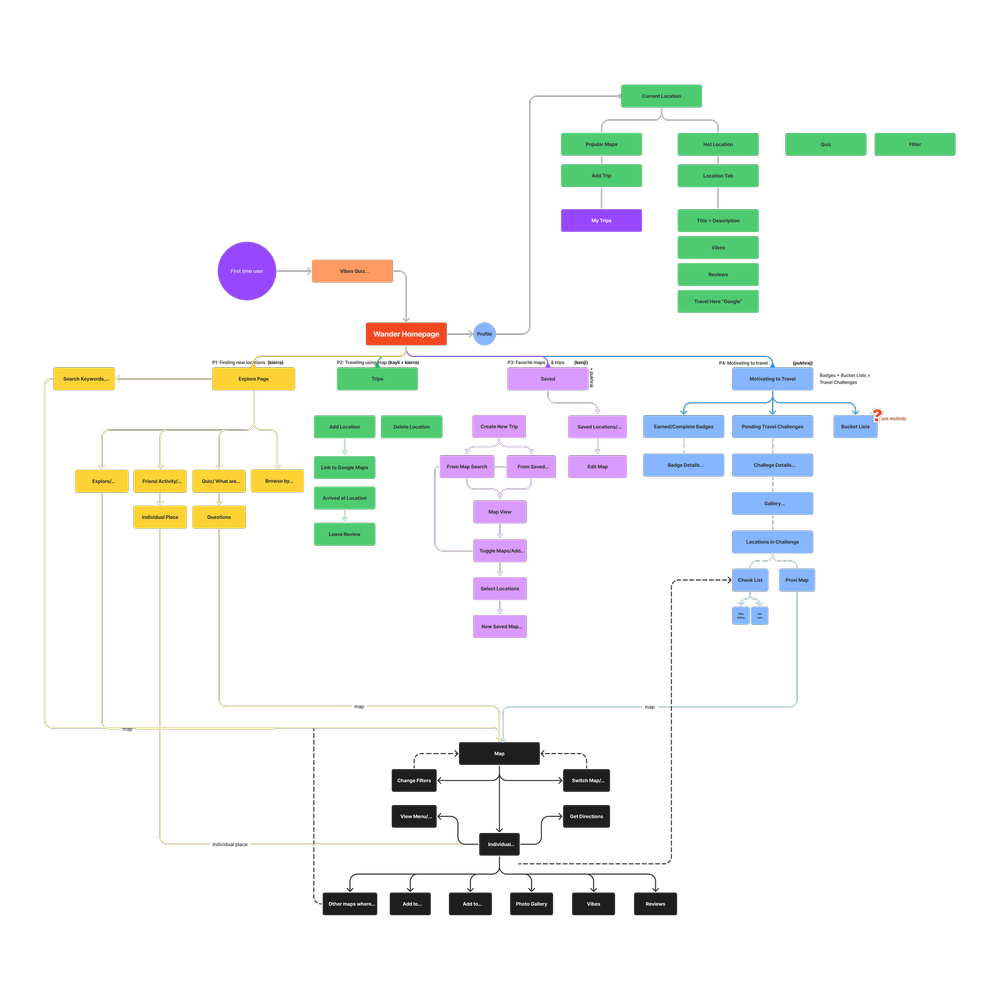
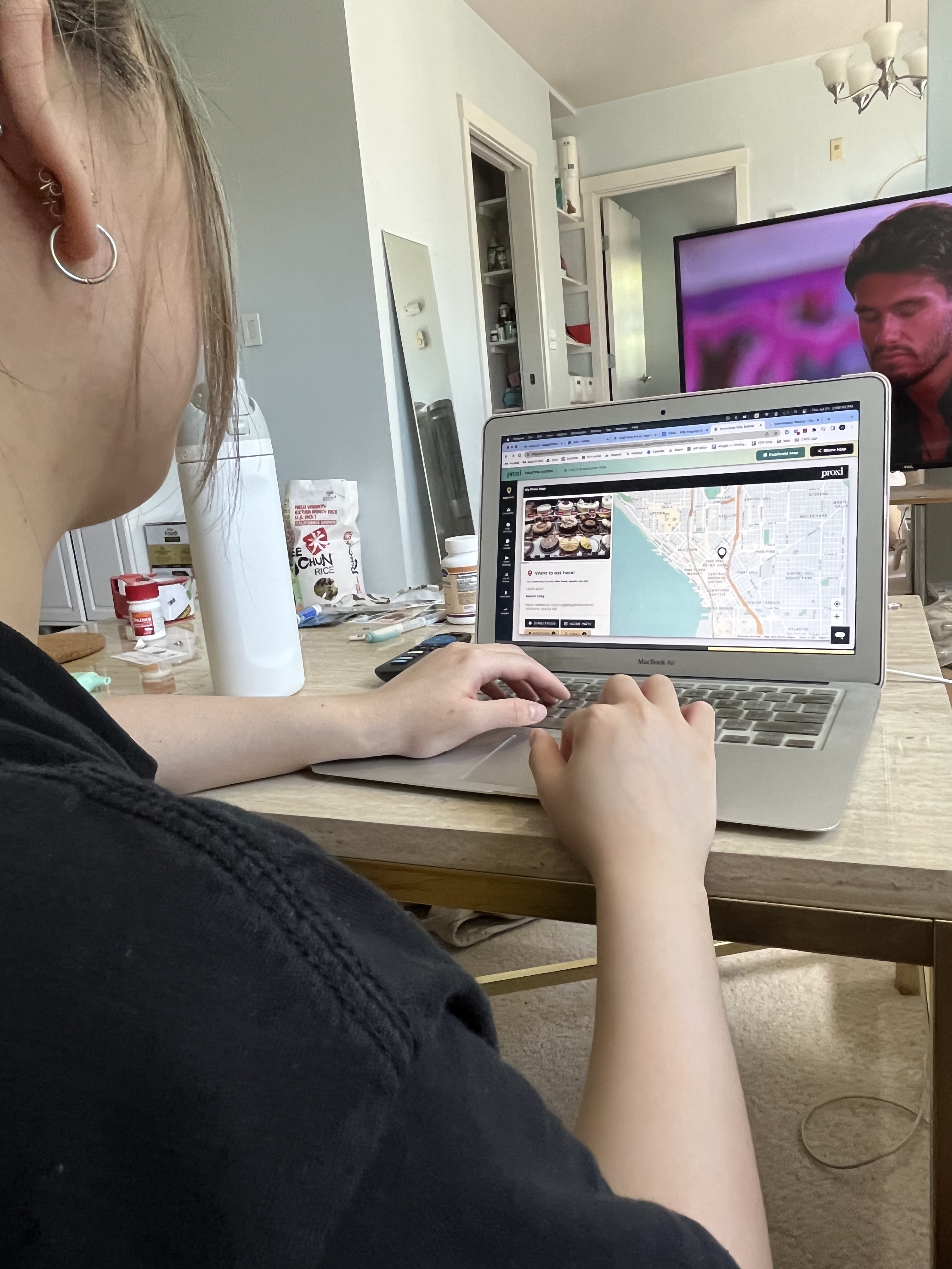
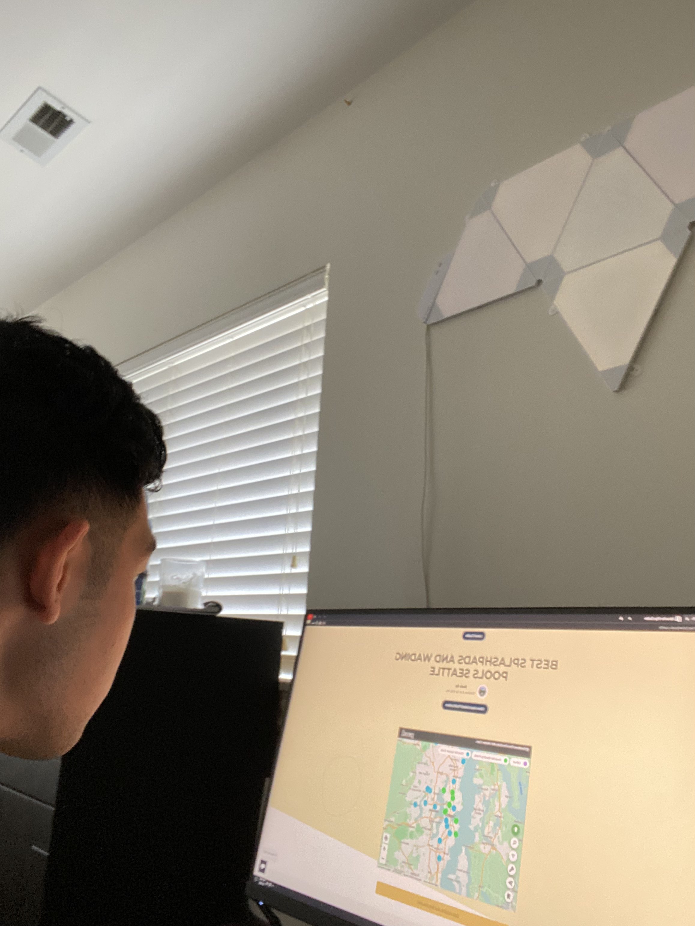
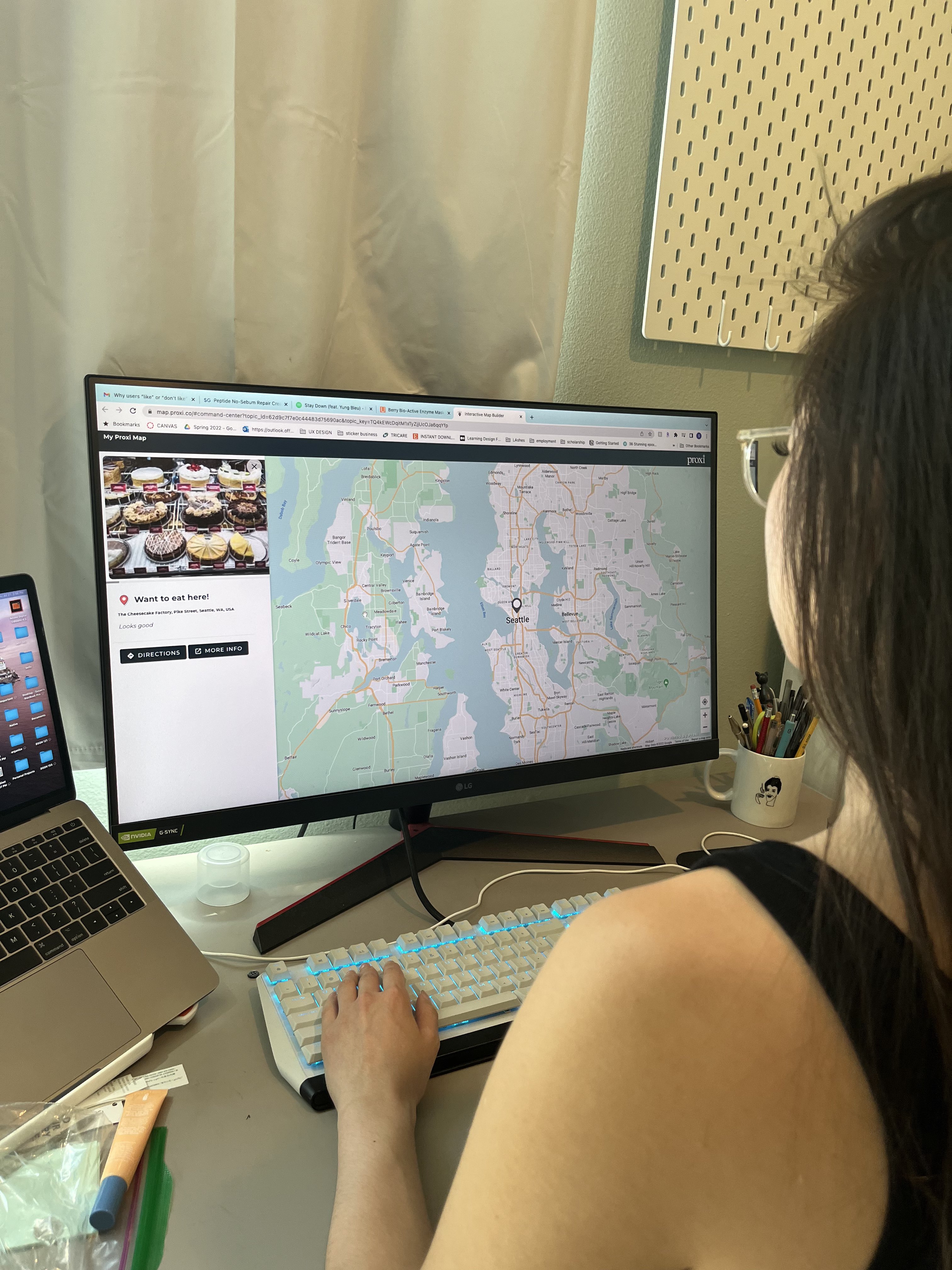
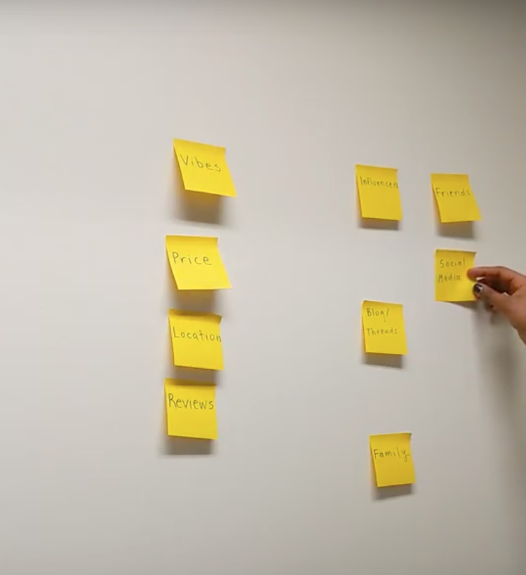
As we were able to finalized our ideas, I created low-fi prototype that represents our features for usability testing before transitioning into hi-fidelity prototypes.

lowfi
Usability Testing

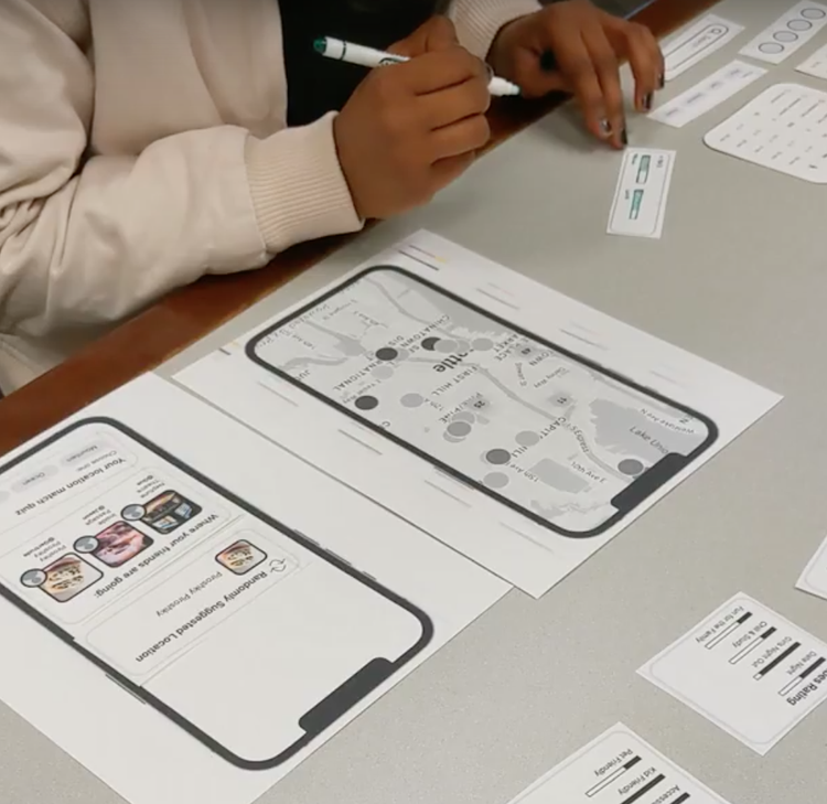
After completing our lo-fi prototype, we sought out 4 users to conduct MULTIPLE moderated Think Aloud testing over zoom. The users were asked to test three specific user flows and share what they were seeing, thinking, and feeling while interacting with the prototype. Within the 3 flows, users were asked to explore a popular map, view their map collections, and filter maps based on a category.

Findings:

  • Implement bookmark for the curated maps
  • A “pinch to zoom” feature for maps would be helpful for users
  • Having a search function and category to find specific locations nearby
  • Display how much of the trip is completed

We then incorporated our findings into our final design.

High-Fidelity Prototypes
Customized Home Feed
  • Allow users to explore curated maps based on categories, popular maps near user, and friends activity
  • Each map has a list of all the location, photos, short description, and the creators of the map

Explore Nearby Locations
  • Recommend user of locations near their current location
  • Allow user to search nearby locations using a search bar and filter

Save Maps to Backpack
  • Allow users to bookmark maps and view them at their convenience.
  • Allow users to organize maps them into different collections.

Impact
10% increase in user engagement
Proxi began implementing some of the designs that we presented to them. One of our feature that is currently lauched on Proxi's platform is the backpack feature. This feature quickly yielded a 15% increase in user engagement.
If I had more time...
I would have loved to conduct in-depth usability studies with various users of differing age groups and tested the prototype in the field/real world scenario. This would have helped us identify some of the feasibility factors such navigation sense, usability of the interface in terms of accessibility, information architecture, and our solution's impact on providing engaging features.
Reflection
It was a great learning experience working with my fellow classmates, all of whom come from various backgrounds of studies. Being able to work with an industry partner definitely made the entire thing much more realistic than a traditional 'no-constraints' class project.
Olivia Tran © 2021-2022
Made with love and effort
OverviewUser ResearchProblemDesign ProcessFinal DesignReflection